I Built My First Multiplayer Browser Game: The Making of Broken Arrow

Released during the 60th Anniversary of the Ia Drang Battle
I am proud to announce that I have finally built a browser strategy war turn-based game, Broken Arrow, based on the historical battle that took place several decades ago in the central highlands of Vietnam. My aim was to launch this game on the exact anniversary of the battle, which is November 14th-18th; however, I was unable to reach my goal due to development and bug issues. Regardless, I was at least able to complete it during the anniversary month.
Key Notes:
It is free to play
The game has both single player and multiplayer mode enabled
For multiplayer:
- Players can host a game as either the US or NVA side, which will provide a code for them to share with a friend to join
- Public matchmaking is also available if players want to play with a random opponent
Turn-based hex warfare
No download required, play directly in your browser
The game map is set directly on LZ (landing zone) X-Ray and the surrounding area
Both sides use 'Command Points' to move units/attack and use special tactics
Origin
Ever since I was very young, I was always intrigued with military tactics and strategy, especially in a game setting. I've played board games like Risk, the digital version of Memoir '44, and many others. I even made my own board games, using inspiration from other games that I've played. Particularly, I was always always a big fan and a bit of a history buff of the Vietnam War. When I saw the movie We Were Soldiers over 20 years ago, I was captivated by the battle - the Battle of the Ia Drang Valley. The tactics and strategies used by both sides, and how everything played out, all interested me so much. Then I searched for games based on this battle, or at least something similar, but found none. Now, quite some time has passed since I was young, and there are now several PC games based on this battle and other Vietnam War battles, as well as some board games. I still, however, had that goal/passion within me to build my own game, particularly about this battle.
Initially, my plan was to develop an RTS mobile game. However, I soon realized that, since I was already very familiar with web development, I could create a browser-based game, which would also reach a wider audience more easily, at least in my opinion. As for the title, I had decided to name my game Broken Arrow a long time ago, because that was the code phrase used during the actual battle, which signaled an American unit was about to be overrun by enemy forces, and called on every available aircraft nearby for immediate air support. This was also portrayed in the movie We Were Soldiers. I felt this was perfect for my game idea, as it matches the sense of danger, urgency, and situation regarding the battle.
This was probably the most fun project I've ever worked on so far. It's technically in the beta phase, and depending on how it goes, I plan to make improvements to it in the long run. If you're interested, please check it out and play: https://brokenarrow.vercel.app
The Process
At first, I envisioned creating the game to be similar to Total War, clicking and dragging troops, units, and formations from a 3D point of view. I really enjoyed Empire: Total War, and wanted to be able to control troop movement and give commands for attack and such in a Vietnam War environment. Come to find out, this was a lot harder than I had anticipated. I tried using Unity as the game engine and searched the internet for ways to get my game to work how I wanted it to. This led me to revert back to what I was already familiar with, which is web development.
I thought that since I knew Next.js, React, and TypeScript pretty well, I figured I could make a playable game using this technology stack. Also, I decided to make the game in 2D, and have a top-down view of the map and game, not just for ease of development but also to kind of resemble a board game. I knew that using 2D sprites was much easier and more than sufficient for my game concept. I also always enjoyed hex-based combat games, so I incorporated that approach.
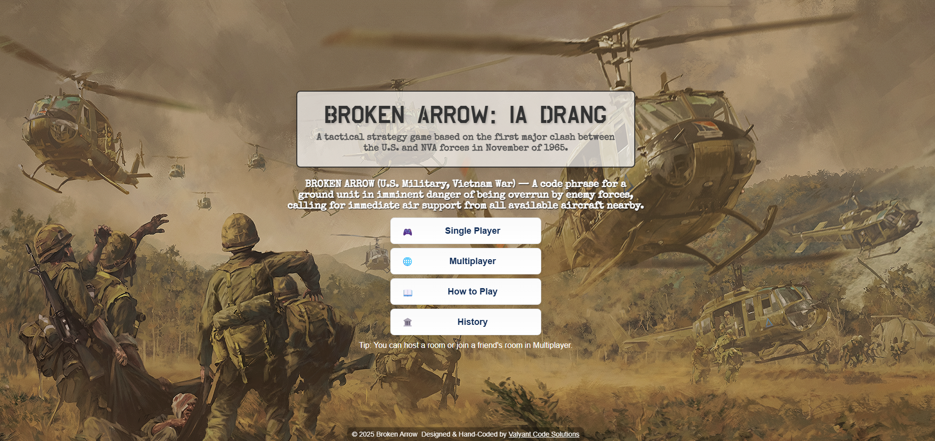
Here's what the home page looked like in the beginning:

If you've played or at least checked out the game already, you might've noticed I used this background image for the single player menu instead. But this was the main home page when I first started, and I wasn't satisfied with how it looked. I always tried to focus on the main functionality and mechanics of the game first, and worry about the UI/UX last.
Here was what the game map looked like in the MVP version:

As you can see, terrain was color-coded. Dark green hexes were dense jungle, light brown were hills (these were removed later), dark brown were ant/termite hills (Ia Drang had quite a few of them, LTC Moore set up his command post on one in the middle of LZ X-Ray during the real battle), tan hexes were dry creek beds, and the light colored hexes were clearings. Although the colors were simple enough to represent certain terrain and was useable to play, I still wasn't satisfied and knew I'd had to eventually change it. I was then going to replace the colors with an overlay of a top-down view of the terrain, for example, a top-down view of a jungle/forest image on the dark green hexes instead. This, in my opinion would've looked better, but then I discovered something during my search online.
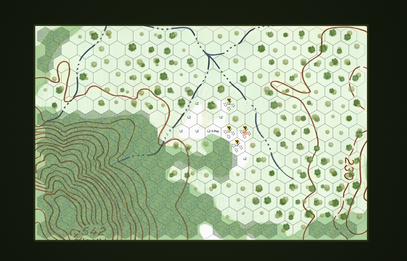
There is a board game called 'They Were Soldiers', which is based on the exact same scenario. The map they used is the real topographical map used during the real battle at the time, and I loved that idea. The makers of the board game modified it slightly to match their game, and I didn't want to 'copy' it exactly, so I tried to find a way to use the same map but keep it original to my personal game. I found the map online and snipped the relevant portion of it that had LX X-Ray, and then I had to enhance it because the image quality wasn't so good. Here's what it looked like:

As you see here, the topographical red lines represented elevation in hills, while the blue lines represented dry creek beds. And of course, you have the white landing zone areas in the center. The topographical lines were bolded using the enhancement tools I applied, and I didn't like that because I thought it made it difficult to see units on certain hexes. Plus, a lot of the other hexes were blank and didn't have any 'life' to them, I felt. You may have noticed the command panel on the left has also improved at this point. I liked this map better than the color-coded one, but knew it wasn't finalized. I had to add a little more detail and make the contour lines less bold.
Finally, here is the final result:

I added little trees to the empty hexes to represent light jungle terrain, and a top-down overlay of forests in the jungle hexes with an opacity. The few blank/empty hexes other than the LZs are clearings that Hueys can land on. The contour lines are less bold and much more bearable than previously. I was very satisfied with this version!
Now, let's talk about the command panel UI. As you can see from a couple of the images above, there's a lot of white space; it's simple and bland. I knew I had to change this eventually, just wasn't sure how. Here's how they looked when I first launched:

And here's how they look now:

I tried to match the Vietnam-era theme of the game. I made the 'Command Points' section a little bigger, since a reviewer gave me feedback and mentioned graphic design hierarchy. The special tactics & action buttons for both sides were modified to match the color of their respective faction's uniform at the time (green for the US Army, Khaki/Tan for the NVA). I replaced all the white background colors with a dark green and a shade of black, which, in my opinion, looked much better.
I also originally had the background behind the game map as just a blank white space. This didn't feel or look right to me either, so I made the same change. I even added a border around the game map, which gives it a trimmed look like a real operations map laid on a command table:

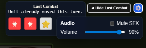
Another modification I made was to relocate the combat log from the command panel to the right corner of the screen. This made all the last action results, activity log, and other notifications much more visible, and I even made it toggleable - as suggested by a user:

After that, I implemented something I had planned for later, and then someone suggested it in their feedback when they noticed the audio was a bit loud. I added a settings option for muting and adjusting the audio and SFX, in the upper right corner next to the combat log toggle: